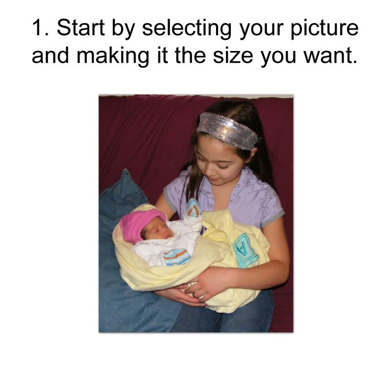
You can work directly on your layout or you can work in a separate image area. Make sure when you set up your image, you leave yourself extra room around the image to adjust the ribbon wrap.

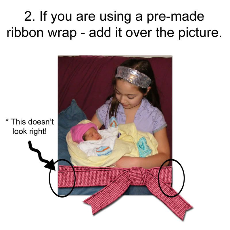
Whenever possible, you should use elements at their original size or reduced slightly - when you increase their size, you run the risk of getting poor results. However, if you need to make your ribbon a little larger, it should be all right. If you change the size of the wrap and use a matching ribbon on another part of your layout, you may want to change that element's size proportionately so they still "match".

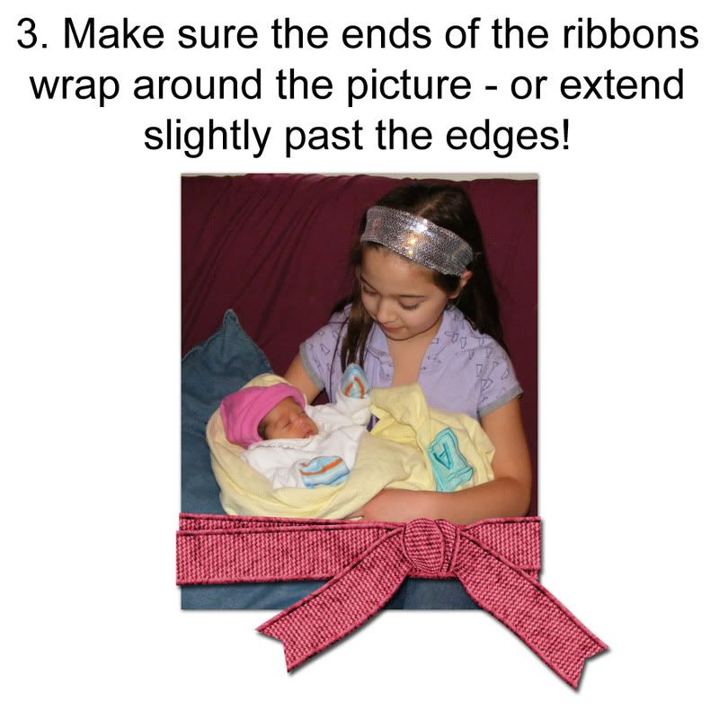
By making sure the ends of the ribbon go just beyond the photo, your brain gets the message that the ribbon is wrapped AROUND the photo. This really does make a big difference on how the layout looks.

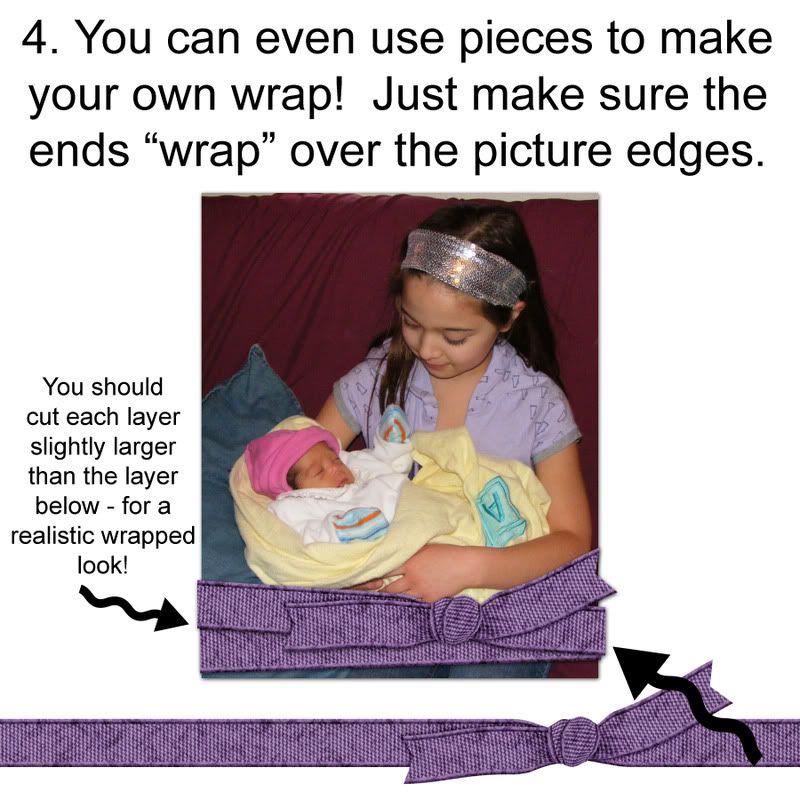
Making your own wrap from pieces of a tied ribbon is actually very easy - and best of all, it can be made to perfectly fit your photo or photo frame! Just be careful to cut the ends of the ribbon as demonstrated in the example - so it has that wrapped look that gives the layout realism.

 Chipboard Freebie
 Template Freebie
 Brag Book Challenge - Jan 2009
 Quick Start Challenge - Feb 2009
 Twist This Template - Feb 2009


No comments:
Post a Comment