I developed this method for creating two page layouts that should share the same basic pieced background. This works by taking advantage of the layering in your software. It is very important to NOT combine layers.
1. Start your layout at the desired size for one page (typically 12x12 inches - 300 dpi) and copy your base layer paper into the layout image.
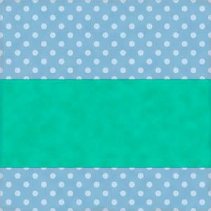
2. For my layout, I'll have a wide strip of paper that spans both pages - but, I only need to put in one strip of paper (we'll use it for both pages). Simply cut the paper to the desired size and paste (or move) it into the layout as a new layer - add shadow.
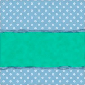
3. I decided to add a fiber cluster to the top and bottom of the strip. Again, copy/paste or move it in and place it as desired then add shadows. You could "stitch" it down, use ribbon, or even beads just as easily as the fiber. Add in an appropriate shadow.
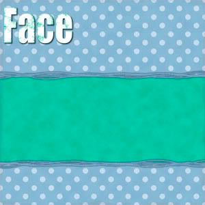
4.a To continue with the idea of making sure it looks like one layout over two pages, I decided to make my title go across two pages. I created my title in a different "image", making sure that I could easily split it between words (I don't like to have a word split).

4.b Then, I placed the title where I wanted it with only the left page showing (the extra word is off the image to the right.)

4. c Finally, I duplicated the layer and moved it so that only the last word showed - I held the shift key down while moving it to keep it from moving up and down (this trick works in PSE - I'm not sure if it works in other programs - just try to keep it "level"). Don't forget to add in the shadows for both layers!
5.a Add the picture to the left page - I placed it under the fiber and angled it - don't forget to add the shadow.

5.b Hide the picture for the left page and add the picture for the right page. You might find it useful to also only have the "right page" portion of the title showing. Place it as desired and add the shadow.

5.c Since the title was shifted to the left, I had some extra space on the right page. I added a minimal amount of journaling to identify the "who and when" for this layout.

6. I know it's funny when you see all the layers at once, but this is right! Save this file in the layered (or native) format for you software.

7. Finally, make only the left portions visible and save with a new name and as a .jpg - then repeat for the right page. Here's the two pages seen side by side!

You should have one layered version saved and two .jpg files saved at full size. Don't forget to create gallery sized versions to share with your online friends!

 Chipboard Freebie
 Template Freebie
 Brag Book Challenge - Jan 2009
 Quick Start Challenge - Feb 2009
 Twist This Template - Feb 2009


No comments:
Post a Comment