Tuesday, December 30, 2008

Creating Your First Digital Layout

Tutorial written by Lorraine:

Creating your first digital layout doesn't have to be difficult. If you already scrapbook using paper, the process is the same, except you can move things around, resize them and you don't need any glue or tape.

We will begin by making a very simple digital layout. For this tutorial, it is assumed that you already understand the basics of how the program you are using works, we are simple building a layout.

1. Choose the photo(s) that you wish to place on your layout.
Choose Your Photo(s).
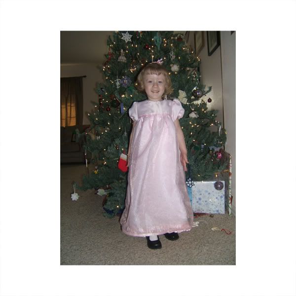
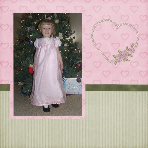
I chose this picture of my daughter Camille in her new Christmas dress. We haven't added the picture yet, but I put it here, so you can see how nice it goes with the background.

2. Choose a kit that will nicely feature your photos. It is not necessary to choose items from only one kit, but at first this can make coordinating elements and papers easier.
Cherished Memories by Paula Yagisawa
I chose to use the kit Cherished Memories by Paula Yagisawa because the pinks seemed a good compliment to Camille's dress.

3. Choose Background.
Choose Background
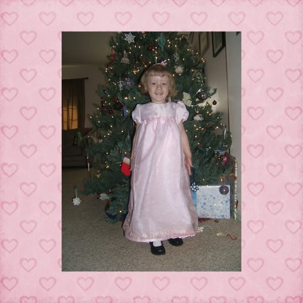
I added this pink paper for my background. It looks nice with my photo!

4. Choose a paper to create a mat(s). Crop the paper and place on your layout.
Add paper mat.
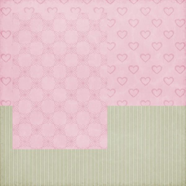
I chose a pink paper to mat my photo, and also decided to add a strip of the green striped paper across the bottom of my page.

5. Crop photos and add to layout.
Add photo(s)
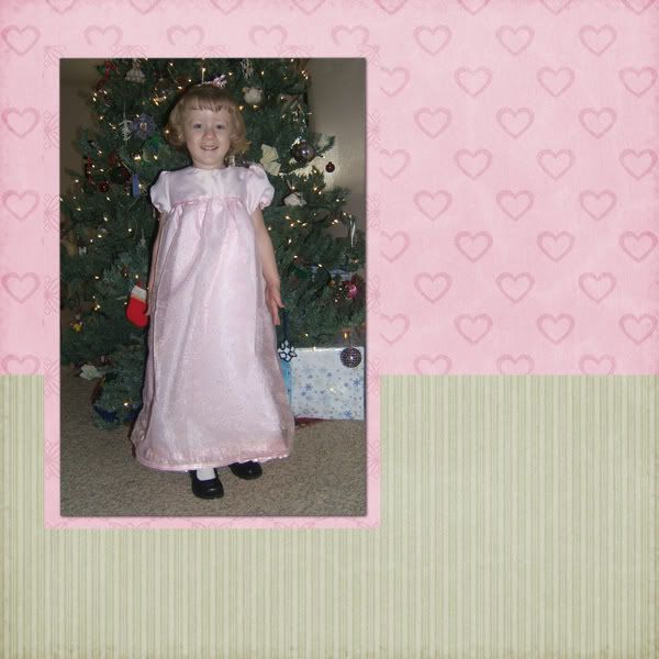
I cropped the photo of my daughter to fit inside my mat.

6. Add embelishments (elements). You can add as many or few as you like. Don't be afraid to try them in different locations or to move them around.
Add embelishments.

7. Add any special effects. (ex: making a string go through the hole in a tag)
Add special effects.
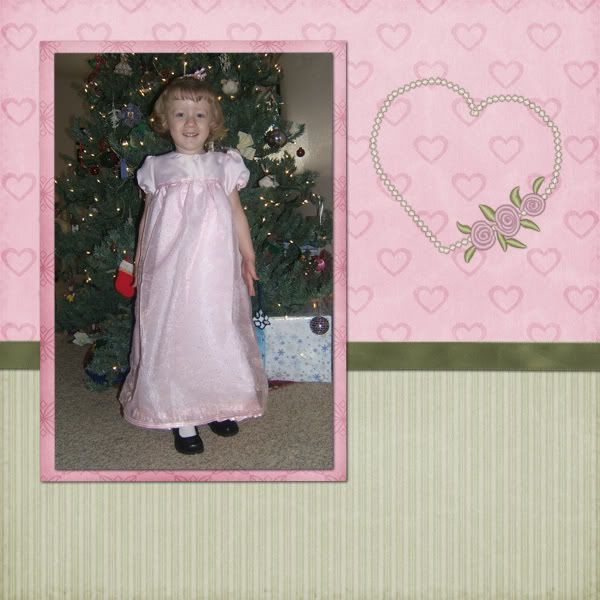
In this case, I used my burn tool to darken the edges of my paper mat to make it stand out a bit. (Similar to inking the edges in paper scrapping.)

8. Add drop shadows. It is important to add drop shadows so that your digital layout appears as it would if it were a paper scrapped layout. This gives much more depth to your page.
Add drop shadows.

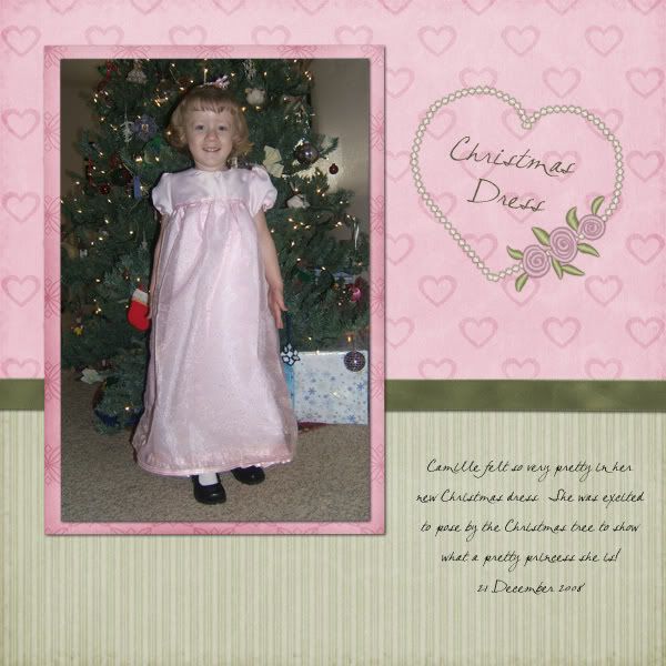
9. Add Title and journaling (text).
Add title and journaling.

10. Record the credits for the products and font you used for your layout.
For this layout I used Paula Yagisawa's Cherished Memories kit and my font was CK Bella.

11. Save as a .jpg and share!

How to Chalk Elements

In "paper scrapping", scrappers will often add color to elements or layouts but "chalking" them. This is where you use chalk to roughly apply a layer of color to an element like paper, chipboard, cardboard, or other porous items.

My favorite digi-scrap item to chalk is chipboard. You'll find a sample of chipboard elements as a freebie in the sidebar of this blog. These are great for you to practice on, but can also be used for personal or commercial use - no credit required!

1. Open the desired element and use the magic wand to select the transparent area of the layer.

Photobucket

2. Invert the selection and contract by around 4-8 pixels. Add/create a new layer - but do NOT alter the selection. (I've shown the selection with drawn in black marks - your software will show you much smaller "marching ants" that mark the selection.)

The reason you want to contract the selection is to avoid coloring the edges. The edges of many elements are created to show some "depth" - if you color over this area, you'll end up with a flat looking element.

Photobucket

3. Select a natural type brush (from whatever brushes you have) and use it to brush or paint your desired color onto the new layer. You can adjust the settings and size of your brush to give you the results you are looking for.

Photobucket

4. Don't try to be neat! You should allow the color of the chipboard to show through in random spots; this will add to the realism of the chalked element.

Photobucket

5. Have fun with this! Work on however many new layers you want and add whatever decorative touches you want for your element.

By working on different layers, you'll make it MUCH easier on yourself to make changes if you decide you don't like something. You can simply hide or delete the layer you don't like and make a new layer to rework your color!

Photobucket

*** Real hand chalked elements would not be perfect - so have fun with this and let them be a little rough or grungy!

Monday, December 29, 2008

Size Really Does Matter!

As a brand new beginner, I recall all the different things I had to learn about digital scrapping in order to get the look I wanted to achieve. One of my earliest mistakes was about SIZE, so I figure this is an issue that many people have a problem with. Hopefully, this will get you off to a good and consistant start!

First, how do you count the size of digital images?

The most important measurement for a computer image is the pixel size. The next most important is the "resolution". The best resolution for printing photos (and digi-scrapped pages) is 300 dpi - that's 300 dots per inch.

Ok, now to your "paper size" – most digi-scrapping kits are created for 12x12 scrapping. So, the papers are 3600x3600 pixels. Many people simply scrap at this size and save them at this size - even if they print at a different size. However, if your computer/software is sluggish or if you want to print rectangular LOs, then you will want to resize to suit your specific needs.

I print my LOs as 8x8 pages, so I sometimes scrap them at that size also. I make my papers 2400 pixels square and re-save them at that size prior to scrapping. I name them originalname-2400.jpg to make sure that I don't lose the original.

Other people like to create their pages and print them as 8x10 pages (great for 3-ring binders and for easy printing at photo labs). The best way to do this is to resize your paper to 10 inches square first - this is 3000 pixels square. Next, trim off or remove the extra two inches; you can simply select the 2400 x 3000 pixels you want to keep. This allows you to keep as much of the pattern in the paper as you want, while getting the right size.

If the paper you are working with isn't a "patterned paper", then you don't need to resize. Simply use your selection tool to get the area you want. Or, you can re-size the paper to the new size – not even worrying about the proportions.

Now that you've gotten the right size paper, you might be wondering about the elements. Well, when paper scrapping, you use the same ribbons, buttons, eyelets, brads, alphas, stickers, etc. - for both 12x12 pages and 8x8 pages. Because of this, you may not need to resize your elements at all! But, many times, the designer may have created the element slightly larger than you would find it realistically; this is because it's always easier to reduce an image than to increase it. If you find that the element you want to use doesn't look correct on your page, then resize it! That's the greatest thing about digi-scrapping!!!!

What about other DPI?

Well, sometimes the picture you want to scrap will simply be a smaller size. You can get an acceptable print at 200 dpi also (though not as nice as 300 dpi). Rather than increase the size of the pictures, you could create the page at 200 dpi; that would be 2400 pix for 12x12 pages, 1600 pix for 8x8 pages, and 2000x1600 for 10x8 pages.

Saving files for printing and sharing:

You should be creating the original file with layers (this is explained in other areas of the tutorial files) and saving it in the native format of your graphics program. Once your page is finished, save it as a .jpg for printing; this will compact all of the layers. Next, resize the .jpg file to 600 pixels square and save with a different name or in a special folder (for Internet sharing); this file should be smaller than 150 kb, if it isn't, then you might need to reduce the quality or the pixel size to make it small enough to share. By making it 600 pixels, it will be large enough to see by those viewing your gallery.

I hope all of this information is helpful to you! I know it was one of the very first things I needed to learn. My first LOs weren't even square - even though I planned from the start to print my LOs and keep them in an 8x8 album.

What is a "digi-scrapping" kit?

Just like a paper scrapbooking kit, a digiscrapping kit is a collection of "papers", ribbons, fasteners, and other misc. elements that are all co-ordinated to go together. The difference - a digi-kit exists in a digital version.

* You can use the papers and elements as many times as you want.
* You can recolor papers and elements to better match your pictures.
* You can manipulate papers and elements to get unique pieces.
* You can also make your own papers and elements!

Each kit you purchase or download for free should have information with it:

Designer name and kit name (check the preview for this information)
TOU/Terms of Use (this tells you how you can and can not use the items in the kit - each TOU is different)
Thank-you graphic (included in many but not all kits)

Refer to these if in doubt about restrictions for use. Also, if you upload your LOs for viewing, you will need to know the designer name for giving credit.

Bottom line -
If you are using someone else's creative work, don't claim it as your own and don't share it!

What is Digital Scrapbooking?

Scrapbooking is collecting pictures, journaling, and memorabilia into a book form - digital scrapbooking is just doing the same thing - but in a digital version.

With the use of graphics software (such as Paint Shop Pro, Adobe Photoshop, or Photoshop Elements) you create a layout (aka LO) using digital "papers" and other elements along with your photographs and any other scanned memorabilia.

Why would you want to digiscrap instead of paper scrap? Well, your digital LOs can be printed over and over again. Or, you can send the LOs to other people via the Internet - this makes it easy to share the pages with family and friends all over the world! You can also use the digital image in the form of a screen saver, DVD slide show, or other digital viewing methods.

Other advantages include: NO MESS! Paper scrapping can be messy. PERFECT pages - circles are really circles and colors can be matched exactly! UNDO button - if you make a mistake, it is very simple to undo that section and fix it! You can't do that with paper scrapping.

Plus - it's a fabulous way to save your memories for the future!

If you are already a paper scrapper, I'd suggest trying some digital scrapping or maybe some "hybrid" scrapping (combining paper and digital scrapping into one project). Many paper scrappers switch over 100% to digital while others prefer the combination.

Tuesday, December 23, 2008

Recoloring Elements

Tutorial by Lorraine

This tutorial will include include PhotoShop short-cuts, but the general directions will work for any program.

General Instructions:
1. Open the element that you wish to recolor.
2. Adjust the Hue/Saturation to get the color that you want.
3. Adjust the Brightness/Contrast to get a better color match.

PS/PSE specific instructions:
1. Pick foreground color to be the color which you want to achieve using the color picker.
Photobucket

2. Go to the Hue/Saturation dialog box by clicking on Enhance-Adjust Color-Adjust Hue/Saturation in the drop down menu, or keyboard short-cut ctrl-u (PC).
Photobucket

Photobucket

3. Click "colorize". This causes the grey-scale element to take the hue of your foreground color.
Photobucket

4. Adjust Hue/Saturation and Lightness to get your desired color. Hit ok.
Photobucket

5. To achieve an even better color match you can adjust the brightness/contrast. To do this select Enhance-Adjust lighting-Brightness/Contrast from the drop down menu. Adjust the slider until you get the color you want.
Photobucket

Photobucket

Hit ok, and you are finished!
Photobucket


Note: if you are recoloring several items to the same color, it is advisable to open them all and recolor them one after another, to get a better match.


As with all things, there are lots of ways to accomplish recoloring an element. Another option is to place a paper or solid color layer over the object and then group the top layer with previous. Then you can adjust the blending modes to get the look you want - perhaps another tutorial for another day!

Using Templates in PS/PSE

Tutorial by Lorraine:

This tutorial describes the process to create a layout in PhotoShop and PhotoShop Elements using a layered .psd or .tiff file.

You can try this on your own using the Freebie Template (see link at right). For this example, I used the freebie template and a paper from Paula Yagisawa's Hula Honey Mini Kit.

1. Open the .psd or .tff file. Resave with a new name, so that you don't accidentally overwrite the template file with your layout.
Photobucket

2. Select the layer in the layers palette which you wish to work on.
Photobucket

3. Copy/open the paper or picture which you would like to have take the shape of the selected layer. There are lots of ways to do this. (I usually have it open and just drag it in.) It should automatically get placed above the selected layer. If it does not, you will need to move it up or down in the layers palette until it is above the layer you are working on.
Photobucket

4. Group the layer with the previous one, which will cause the paper/photo layer to take the shape of the layer below it. This is the magic! Here are three different ways to do this:
- With the paper/photo layer selected in the layers palette, select Layer-group with previous from the drop down menu.
Photobucket
- With the paper/photo layer selected, use the keyboard short-cut ctrl-g (PC) to group the layer with the previous.
- Place your cursor over the line separating the two layers in the layers palette and hold down alt. The cursor will change from a hand to an image with a little black arrow next to some overlapping circles. Click, and it will group the layers.
Whichever method you use, you will notice that your paper now takes the shape of the layer below it, and in the layers palette, it has been indented slightly with a little arrow in front of it.
Photobucket

5. With your paper/photo selected, you can now move and resize it so that the part you want to see is visible.
Photobucket

6. Highlight both layers (hold down shift and click on both) and then merge the layers together. (Some people skip this step, but I find it helps me have a less cluttered layers palette.) To merge layers do one of the following, right click and choose merge layers; hit ctrl-e; or select Layer-Merge layers from the drop down menu.
Photobucket

Photobucket

7. Apply any shadows or layer styles you wish to the layer.
Photobucket

8. Repeat the process with the other layers of the template.

9. Some layers, you may wish to simply replace the shape with an element (such as a button or ribbon) from your digital stash. Some layers may actually be items that you can recolor (such as the buttons and ricrac in the template example.) See the tutorial on recoloring elements to learn how to recolor these objects.

10. Most important, remember, a template is only a guide. Make it your own by adding and subtracting elements or papers, or moving things around!

Justifying text in PSE

In PhotoShop elements, you might notice that the only choices for text are centered, left justified and right justified. It is however possible to have fully justified text using the keyboard short-cut from the full version of PhotoShop. Here's what you need to do:

1. Create a text box and type out your text, having the lines wrap.
2. Highlight the text.
3. Hit ctrl-shift-J (for a PC). The text is now justified!

Monday, December 22, 2008

Two Page Layouts - Stacked Method

I absolutely LOVE the look of a two page layout - I like to see them printed out and placed on facing pages in an album. To me, they look their very best when they look like one layout that just happens to cover two pages.

I developed this method for creating two page layouts that should share the same basic pieced background. This works by taking advantage of the layering in your software. It is very important to NOT combine layers.

1. Start your layout at the desired size for one page (typically 12x12 inches - 300 dpi) and copy your base layer paper into the layout image.

Photobucket

2. For my layout, I'll have a wide strip of paper that spans both pages - but, I only need to put in one strip of paper (we'll use it for both pages). Simply cut the paper to the desired size and paste (or move) it into the layout as a new layer - add shadow.

Photobucket

3. I decided to add a fiber cluster to the top and bottom of the strip. Again, copy/paste or move it in and place it as desired then add shadows. You could "stitch" it down, use ribbon, or even beads just as easily as the fiber. Add in an appropriate shadow.

Photobucket

4.a To continue with the idea of making sure it looks like one layout over two pages, I decided to make my title go across two pages. I created my title in a different "image", making sure that I could easily split it between words (I don't like to have a word split).

Photobucket

4.b Then, I placed the title where I wanted it with only the left page showing (the extra word is off the image to the right.)

Photobucket

4. c Finally, I duplicated the layer and moved it so that only the last word showed - I held the shift key down while moving it to keep it from moving up and down (this trick works in PSE - I'm not sure if it works in other programs - just try to keep it "level"). Don't forget to add in the shadows for both layers!

Photobucket

5.a Add the picture to the left page - I placed it under the fiber and angled it - don't forget to add the shadow.

Photobucket

5.b Hide the picture for the left page and add the picture for the right page. You might find it useful to also only have the "right page" portion of the title showing. Place it as desired and add the shadow.

Photobucket

5.c Since the title was shifted to the left, I had some extra space on the right page. I added a minimal amount of journaling to identify the "who and when" for this layout.

Photobucket

6. I know it's funny when you see all the layers at once, but this is right! Save this file in the layered (or native) format for you software.

Photobucket

7. Finally, make only the left portions visible and save with a new name and as a .jpg - then repeat for the right page. Here's the two pages seen side by side!

Photobucket

You should have one layered version saved and two .jpg files saved at full size. Don't forget to create gallery sized versions to share with your online friends!

Proper Resizing for Photos and Elements

This little technique is one of the simplest and most obvious, but if you haven't learned how to do this, then it's one of the most common mistakes I've seen in layouts!

We all need to change the sizes of pictures and elements while we digi-scrap. In fact, it's one of the reasons many of us love digi-scrapping; changing the size of your photographs and elements is very simple to do!

But.... if you don't know this one simple little trick, then it's very easy to make a drastic mistake!

In the layout shown below, I "made the mistake" you often see. I resized the photograph and the snowflake elements to fit my space without really making sure they looked right. People make this mistake when they don't know the trick to keep the pictures correct - or when they are trying to force an element or picture to fit into a shape or space.

Photobucket

The next image shows how the layout should be done. I only used two repeats of the snowflake element because three didn't fit nicely when I resized properly.

You can see on the photograph how in the first layout my daughter appears to have gained weight - the second layout shows her true proportions. Well, that's exactly what we need to do when we resize - we need to "keep the proportions"!

Your software most likely calls this: Maintaining the Aspect Ratio. In other words, if you double the height, you also want to double the width. It works no matter how much or how little you change the size!

Photobucket

How to make sure you are maintaining aspect ration:

1. If you are changing the size by "dragging a corner" of the shape (done with different tools in each program) then simply hold the shift key down while you change the size. This tells the software to make sure the ratio remains consistent!

2. If you are using some other "resizing" command, then look for a box to click that tells the software to keep the ratio.

Here's the "sketch" I used for the layout above - feel free to use it for a layout of your own!

Photobucket

Hanging Charms or other elements

One of the biggest challenges for a digi-scrapper is getting something to look "behind and in front of" another element. Such as hanging charms from a fiber. You want the fiber appear to pass THROUGH the loop on the charm or chain! Well, there are several ways to accomplish this - once you try one, other ideas will probably come to you.

The following "image lesson" explains a very simple way to accomplish this that should work in any software. I've included additional tips and notes in the text to help you with other methods or techniques.

Photobucket

I always add and place my fiber elements before the piece I'll be hanging on it or placing over it.

Tip: To get a small shadow, try seeing if you can set the size to ZERO. In PSE, this will give you a very small shadow that shows slightly all the way around the element! Perfect for fibers or stitching or such

Photobucket

Since you'll be duplicating the layers, it's best to get your placement right BEFORE you duplicate the layer. When you change the layer position - that is changing the order of the layer, not where it appears on the layout. If you ever need to shift the placement of the element, you should link the duplicated layers together; this will cause both layers to move in exactly the same way.

Photobucket

You can add the shadow to the charm/chain before you do your erasing - with the illustrated method, it doesn't make any difference.

Sometimes (and in some programs) you'll find that when you erase the top layer, you get odd shadows. To prevent this, you can add the shadow first and then simplify the layer (PS term - not sure in other software) - you want to cause the shadow pixels to be part of the element/layer instead of a style/filter that is adjustable. Now, when you erase the top layer, you won't get odd shadowing!

Depending on what type of elements you are working with, you might find it easier to use your magic wand selection tool to highlight on the fiber layer background. Invert the selection and then work on the top layer of the charm/chain. Now, you can ONLY erase the areas that are over the fiber! You'll still need to erase instead of just clearing - since other areas are also selected.

Photobucket

You can "fit" the chain loop as tightly to the charm as you want - just make sure they look realistic!

Photobucket

This same technique works to weave ribbons or to add a ribbon slide to a ribbon. You'll find many ways to use these same basic techniques!

As with so many techniques, there are several ways to accomplish the same thing. Using the double layer method isn't always necessary, but it helps to make your end results more realistic.

If you are working on something that will also need a shadow ON the top layer of the element, you might have better results from drawing it in yourself. Do this on a layer all alone (under that top layer). You know, this might just make a great future tutorial!