This tutorial is not software specific!!! I'm not telling you which buttons to push - just the concept behind the process.
To create your own templates, you will need graphic software that can work in layers!!!!
STEP 1:
First, create a new image - transparent background (it should look like grey and white squares) - 300 dpi - 12x12 inches (or 3600x3600 pixels).

STEP 2:
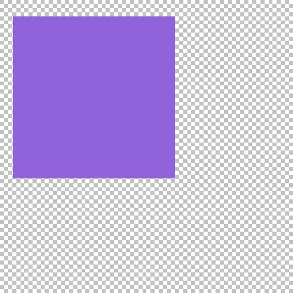
Now, you need to start thinking of what shapes you want for your template (and eventually a LO) - I think we should start with a square mat of paper. I'll put it near a corner and have it fill more than half the page. When I create templates, I normally work in different grey colors, but you can use colors just as easily; I'm using colors here to help you see them.
The most important thing is to remember to work in layers - each new shape or item should be on it's own layer! You could use the rectangular selection tool or a shape tool to make the mat.
STEP 3:
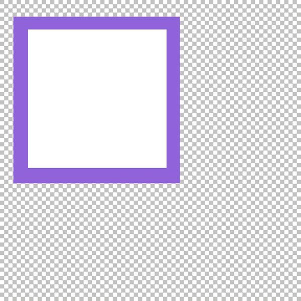
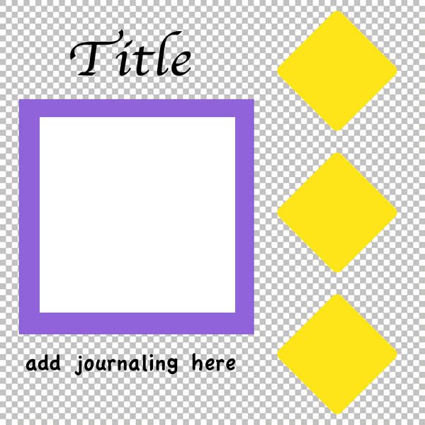
I'm going to keep this template fairly simple (in many ways, this is similar to my first digital LO). Let's now put a new layer and a square shape for our photo. This should be smaller than the mat and centered over it.
STEP 4:
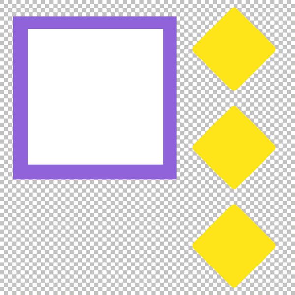
I'm thinking that the right side of this LO would be a great place for decorations or something - those could of course be added after you've added your papers to the LO, but let's add a shape that would be a nice foundation for any elements we want to use.
I think diamonds would be pretty! So, I used my diamond shape tool to make a diamond in the top corner. I used "duplicate layer" to make two copies that I moved into place. You can create the shape three times or use any method of copy/paste you want and are comfortable with. Be careful to keep them lined up properly and evenly.
You could combine these diamonds into a single layer or make each diamond it's own layer - that choice would be yours!
STEP 5:
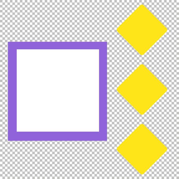
Change of plan... we are allowed to do that! I've decided that I'd rather have the mat and photo down lower instead of in the corner. Well, they are on layers, so this is very easy to do! I moved them down - making sure to move the photo into the center of the mat again.
STEP 6:
Just to keep things easy, I've decided to add a font to this template. So, my final layers will be to place the font (selecting the size and all) for both the title and the journaling. This works best when you know you will be using it in the same software you created it in! I like the title above the picture and journaling below it.

 Chipboard Freebie
 Template Freebie
 Brag Book Challenge - Jan 2009
 Quick Start Challenge - Feb 2009
 Twist This Template - Feb 2009


No comments:
Post a Comment