
One of the first lessons that any digi-scrapper should learn is proper shadowing. After layering, it is probably the most valuable lesson you can learn! For these tips, I've created 4x6 sample layouts; this is because when you view a 12x12 page, you often look at it "smaller" than it truly is. When you work with a 4x6 layout, you can view it on screen at closer to print size; this allows you to get a better since of how it will look printed at true size. However, the same rules and tips apply to ANY size layout - they are just easier to see this way.
Example One: No shadows at all
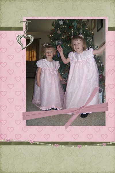
When I first started scrapping - and I'm sure when many others first started, I knew NOTHING about adding shadows in a digital image or layout. But, without shadows, your layout will look so flat and bland. There is no depth or dimension to give it a realistic look!
Example two: default shadows all around
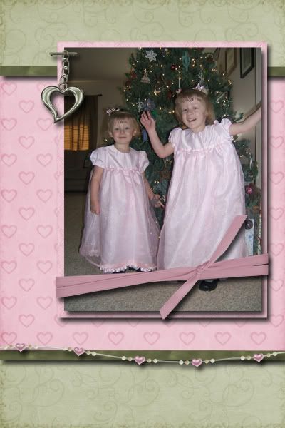
So, every scrapper goes through a stage where they have learned how to add shadows, but not how to adjust them. Every shadow is the same - and they all appear too deep! This layout is created with PSE 5,0 - and the default shadow was a size of 21 pixels, distance of 21 pixeks and opacity of 75%. There is also a default color for the shadow. As you can see, it just doesn't look "real". (Note: Different software programs, and versions will have different items you can adjust to affect the look of the shadow.)
Here is a screen shot from PSE 5.0 to show you how to adjust the shadow in this program. All versions of PhotoShop will have a similar appearance.
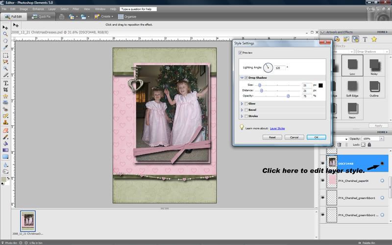
Once a layer style is applied (a shadow is a layer style), you can adjust the default settings by clicking on the little sun shaped image at the right side of the layer in the layers palette. This will bring up a window where you can adjust the settings, and they will change in your image as you adjust so you can tell when you have what you want.
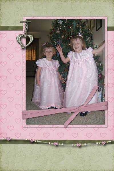
Example three: shadows adjusted
Get out a sheet of printer paper and lay a few items on it. If you place a picture on it, you will see a very faint shadow. If you place a button, it casts a larger shadow. A sticker or stitching will have almost no shadow at all! But beads will cast a large shadow by comparison. This is how a "real layout" would look, and it's how we want our digital layouts ot appear.
So, think about the thickness of the element and how you want it to appear. For papers and photos, I use a shadow with a small distance and a bit bigger size - for the chain, the shadow would be bigger. The charms and beads are the thickest items, so they should have the largest shadow. I placed a larger shadow on the ribbon wrap than on the green ribbon because is would come up higher off the page and thus cast a larger shadow. The key is, play with it until it looks real - look at it as close to print size as you can, so you can get a good idea of how it will look printed.
Don't be afraid to play. The beauty of digital scrapbooking is that if you don't like it you can always change it!
Other tips:
90% or more of designers create their elements to appear as if the light is shining from the top left side. To get a truly realistic look, your light source should be the same!
If you are placing a ribbon or other long element at an angle from top left to bottom right, the above light source wouldn't leave much if any shadow. But, this looks silly on the printed page. The solution, set this shadow so that it doesn't use the "global" setting - pick a slightly different angle, just enough to you can see a slight shadow.
For really small items, such as stitching, it is sometimes nice to have a shadow that just barely shows all the way around. In PSE, I am able to do this by creating the shadow and then changing the setting to zero. That's right, at 0, the shadow doesn't go away, it just shows tiny all the way around. This may not be on all versions, so just play with your settings until you like the effect.
Can't get it to look right with the standard settings? Try creating a new layer and the paint brush to DRAW your own shadow. Just change the opacity until you like the look - you can even move it more or less under your element until you get the right size! If it doesn't look right, delete or hide the layer - you haven't hurt a thing.
The layout I created for this tutorial used Paula's Cherished Memories page kit.
 Chipboard Freebie
 Template Freebie
 Brag Book Challenge - Jan 2009
 Quick Start Challenge - Feb 2009
 Twist This Template - Feb 2009


No comments:
Post a Comment